

Since 1995, New Hope Peru has provided a stable, loving environment for orphaned, abandoned, and at-risk children in Arequipa, Peru. Their children's home offers safe shelter, health care, education, and loving care in a family environment that prepares kids to become leaders and develop their unique skills and abilities.
THEIR CHALLENGE
As New Hope Peru looks to the future, leadership needed to align around the "fruit" of their work, key metrics for measuring communications success, and type of donor they want to reach. They also needed refreshed visuals that engaged donors and provided clarity about the different areas of the ministry.

Logo Detail - Typography Complements the Form of the Brandmark.
OUR SOLUTION
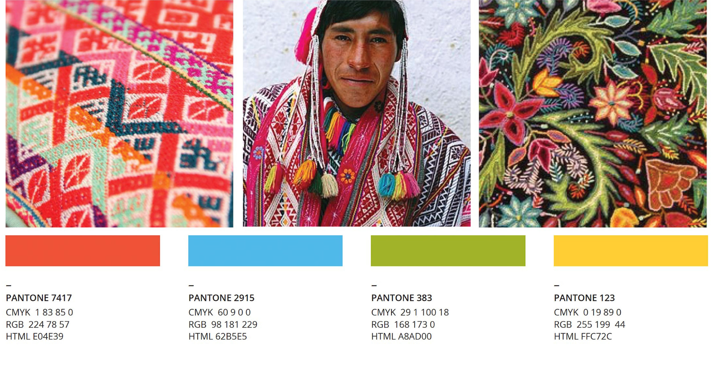
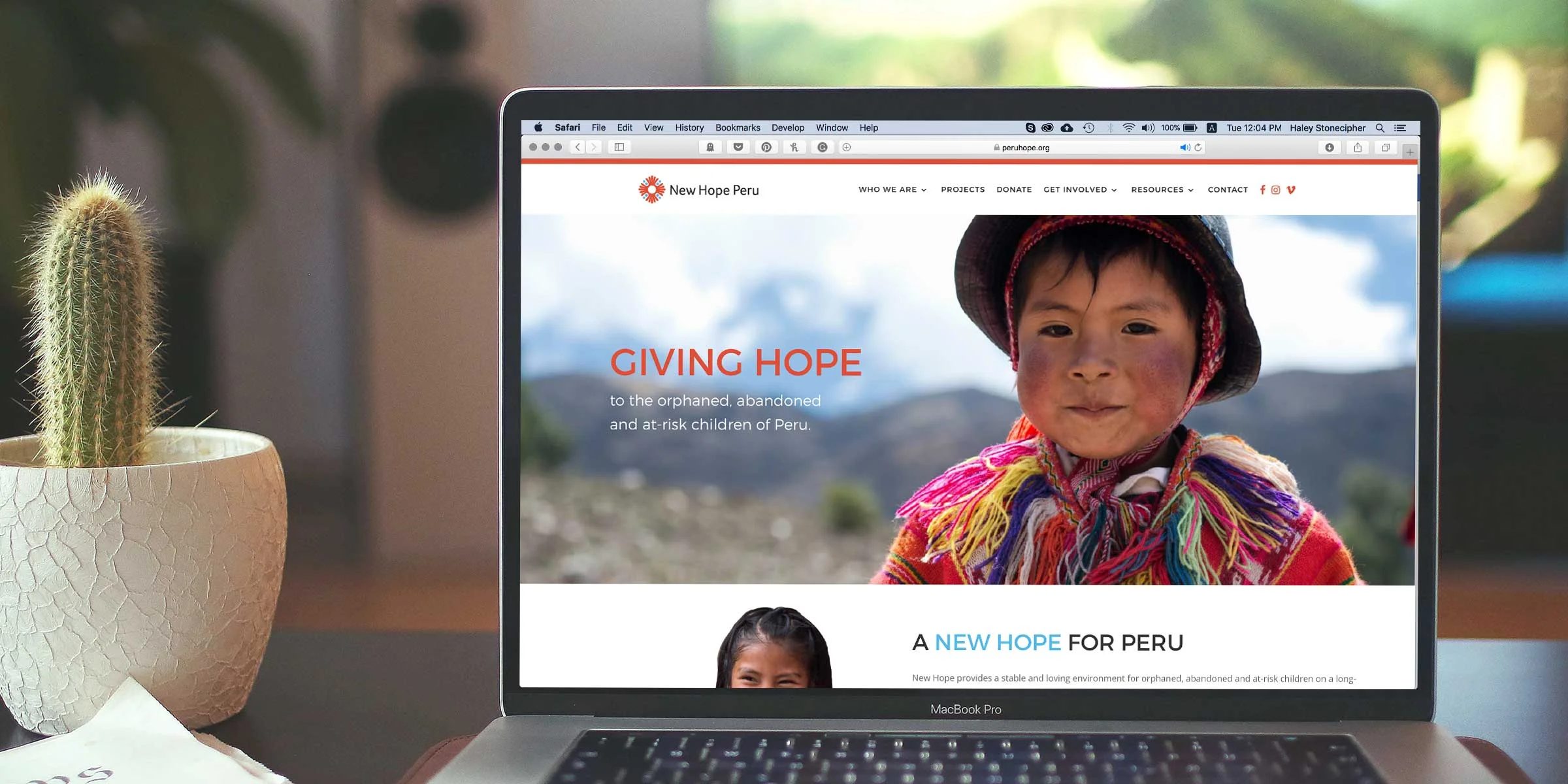
We created a plan to help New Hope Peru's leadership team establish a firm foundation for future communications work, along with tools to further those efforts. That included a new logo and brand architecture design to showcase the ministry's hope and vibrancy, incorporating colors inspired by the country of Peru.

Before Rebrand

After Rebrand
INSPIRATION & COLOR PALETTE
"We found the [leadership alignment] sessions really valuable, and are feeling well poised to take next steps. The frameworks we developed were brought up again and again as we continued shaping the ministry to reflect these values and strategic choices."
–Julie Bolos, Director of Communications, New Hope Peru

Sub-brand Logos


Logo Application

Spanish Version
